

Primary & Secondary Colors | Definition & List
Key Highlights
-
The primary colors are red, yellow, and blue. These be the main colors that you use to make all other colors.
-
A secondary color, for example orange, green, or purple, is what you get when you mix two of the primary colors.
-
A color wheel is a tool that helps you see how each color goes next to the other. It shows you how each color connects.
-
Color theory shows people how to mix and choose colors the right way.
-
A tertiary color is made by mixing a primary color with a secondary color. This gives you more shades to work with.
Introduction
Color is all around us. It can change how we feel, what we think, and help us see things in new ways. Color can send a clear message and make art feel alive. To get good at working with colors, you have to know some basics first. A key thing to start with is the color wheel. Sir Isaac Newton, or Isaac Newton, made the first color wheel back in 1666. This round chart helps you see that every shade comes from mixing primary colors. The color wheel is the base for all color theory and every color palette people use.
Understanding Primary and Secondary Colors
In art, the first thing you need to learn about is primary colors. There are three primary colors you start with, and they are red, yellow, and blue. You cannot make primary colors by mixing other pigment colors. All the other colors you use come from these basic colors when you make a palette.
You can use the three primary colors to make new colors. When you mix two primary colors in the same amount, you get a secondary color. This is a good way to find more colors for your color scheme. It gives you many choices for any project you have.
What Defines a Primary Color?
A primary color is one you see at the start of color theory. You can't make this color by mixing any other pigment colors. In the color model most painters and artists use, you work with three main colors. These are Red, Yellow, and Blue. They are the first shades in RYB. Every other color in paint or ink comes from these.
Red, yellow, and blue play a big part in color theory. Every color comes from these three. You need to know about them if you want to get good at color mixing. You use them first when you start to mix and make new colors. All artists should learn about them early when they work with color mixing and color theory.
Without primary colors, you would not be able to get green, purple, orange, or so many other colors. The primary colors are at the center of the color spectrum. They let you make new colors. When you use primary colors as you paint or print, you can make lots of choices. You also get to be creative.
What Defines a Secondary Color?
A secondary color is made when you mix two primary colors together. In traditional color theory, there are three secondary colors. These are orange, green, and purple. On the color wheel, you see each secondary color is placed between the two primary colors used to create it. This shows how the color wheel helps you see the link between secondary colors and primary colors. It also helps you know what color theory says about how all these colors connect.
The recipe to make each secondary color is simple. To get orange, mix red and yellow. To make green, you need to put yellow and blue together. If you blend blue with red, you will have purple. This type of color mixing is a key skill for artists. They use secondary color to add more color in their work.
These colors are the first step when you go beyond basic colors. They bring more fun and make your work feel fresh. Designer Jacob Obermiller says, "Secondary colors give you more ways to put colors together. People feel the project is theirs. It feels one-of-a-kind." Adding these makes your artwork feel lively, show more style, and have a strong feel.
The Classic Primary Colors in Art
In traditional color theory, people know that the primary colors are red, yellow, and blue. Many artists use these colors when they mix paints and inks. This way of working is called the RYB color model. A lot of artists pick the RYB color model when they make art. The three primary colors are a key part of color mixing in art. Every other color can be made by mixing these. The primary colors are important in the way that artists use color mixing through traditional color theory.
You can use the three primary colors to mix and create the three main secondary colors. These are orange, green, and purple. The six colors make up the base for many color wheels. A lot of people use them when they do art.
Red, Blue, and Yellow Explained
Red is a bright and strong color. Many people think of it when they feel passion, energy, or warmth. It is a main part of the RYB color model. That is why you see red in both the group of primary colors and secondary color groups. When you mix red with yellow in this color model, you get orange. Orange is a lively and bright secondary color. If you mix red and blue in the RYB color model, you get purple. Purple is another deep color.
Yellow is the brightest of the primary colors. Many people feel happy, light, and full of hope when they see yellow. If you mix this color with blue, you get green. And when yellow is mixed with red, you get orange. Having yellow in your palette can make your artwork feel better and even more happy. Yellow is an important part of the primary colors.
Primary colors play an important role in art.
Blue is a calm color. It helps people feel peace and feel steady. In the RYB system, blue is key. Blue helps make green and purple. The way you use blue can make it feel soft and quiet in the background. Blue can stand out if you use it as the main focus. Its versatility works well in many ways.
Why You Can’t Mix Primary Colors
You can’t mix primary colors because of how pigment colors work. In a color model that uses paint or ink, primary colors are pure. They don’t come from mixing other colors. Other colors start from them. Each primary pigment takes in some light waves and sends back others. The way primary colors in pigment colors react to light is special. You can’t make them by mixing colors with their own ways of using light.
When you blend two colors like green and orange, you mix pigments that pull in bits of light. The color you see after mixing will seem less bright or even a bit muddy. This happens because the pigments in the mix take in more light. For instance, if you join all the primary colors together, you will get a dark, brownish-gray shade. You will not end up with a fresh, sharp color but a muddy look instead.
Primary colors are important because you can't get them by mixing other colors. They always stay the same because nature and science gave us these main colors. You use primary colors to make many other colors. But, you can't mix anything to get primary colors.
How Secondary Colors Are Created
Making a secondary color is easy. All you have to do is mix equal amounts of two primary colors. The color wheel shows this well. A secondary color sits right between the two primary colors that you mix to make it. This shows how color mixing works and how the colors are linked. The color wheel helps you see how primary colors and a secondary color go together.
This idea is very important for art education and practice. If you can mix bright and real secondary colors well, you will get a big skill. This will help you make more colors, not just the basic three. It lets artists get better and use new colors in their work.
Mixing Techniques Using Gel Press Plates
Gel Press plates are a smart pick if you want to get the feel for color mixing. They let you make new colors, like secondary colors. The plate has a surface that is both smooth and soft. This makes it easy for you to mix paint before you lift the print. A Gel Press 8x10 Plate is a good size for anyone who wants to practice color mixing in the studio or classroom.
To get a secondary color with your Gel Press plate, start by using the primary colors. First, put some of one primary color, like red, on the plate. Next, add a little of another primary color, such as yellow. Make sure you leave a small space between each color. By doing this, you will make a new secondary color.
Use a brayer to roll the paints on the surface. Move it back and forth in the paint. You will see how the two primary colors start to mix together. When you do mix them, you get a bright and strong secondary color from it. Here, the color made will be orange.
-
Put a bit of blue paint and a bit of yellow paint on the plate.
-
Use a brayer to roll the paint. Make sure the paint is smooth and you get an even green color.
-
Put your paper on the plate. Press it down well. Then pull up the paper to see the new mix of colors.
Examples of Secondary Colors in Everyday Life
When you start looking, you see secondary colors everywhere around us. The colors can be seen in food and places that we go to. They are a part of our daily lives. When you notice them, you learn more about how color works. Seeing these colors well can help you get better at art. You also understand color schemes more.
Nature is great at showing all kinds of secondary colors. You can see a deep purple on an eggplant. A forest has its own rich green on the trees. A sunset glows with bright orange before night comes. You find these colors every day out in the world. They give people, like you and me, who want to make something new, lots of ideas to use in what we do.
Here are some things that people see often every day:
-
Orange: You can see the color orange in carrots. The color is also in pumpkins and oranges. Look for it in autumn leaves, too.
-
Green: They use green in grass. You see it on leaves of trees. It is the color you find in limes and traffic lights.
-
Purple: There is purple in grapes. The color is also in lavender flowers and amethysts.
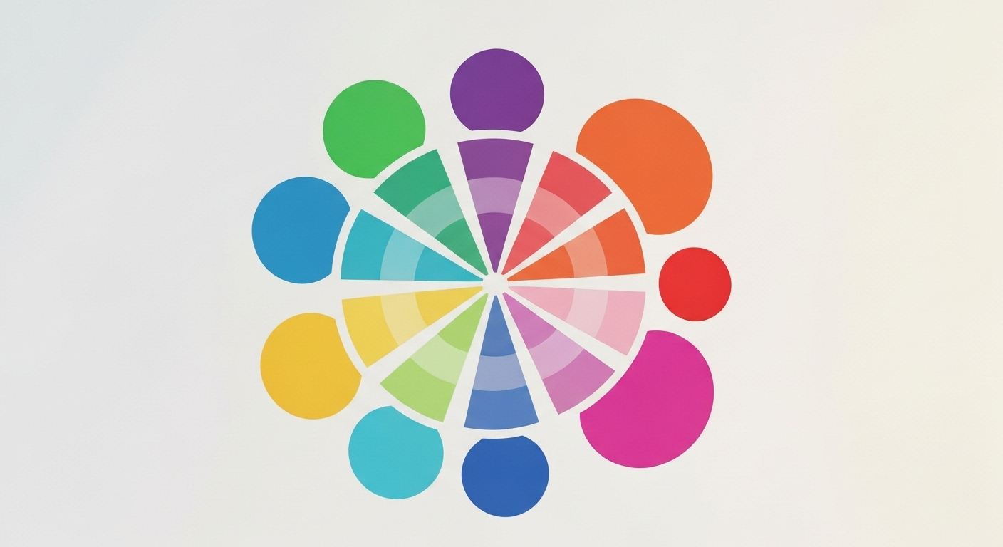
The Color Wheel: Connecting Primary and Secondary Colors
The color wheel is the most helpful tool used in traditional color theory. It shows how colors look and work next to each other. Color Matters says that it is "a logically arranged sequence of pure hues." With the color wheel, we get to see how one color connects with another. If you want to learn about color theory, it is good to begin with the color wheel. [Source: Color Matters, Basic Color Theory, https://www.colormatters.com/color-and-design/basic-color-theory]
This visual map makes it easy to see how primary colors and secondary color connect. The three primary colors are spaced out the same way from each other. You can see the secondary colors sitting right in between the primary colors. This helps you know which two primary colors you need to mix to make a secondary color.
Visualizing Relationships on the Color Wheel
The color wheel is more than just a bunch of nice colors put together. It helps people see how the colors link with each other. The color wheel puts the main pigment colors—red, yellow, and blue—in a triangle shape. The colors you get from mixing these main pigment colors sit between them on the wheel. This makes it clear which two colors you need to mix to get a new one.
This layout gives you the basics of color theory in a simple way. You can see that orange is between red and yellow. That helps you know where it comes from. This wheel also helps you pick out complementary colors fast. These are the colors right across from each other, like red and green. These color pairs really stand out and feel balanced to your eyes.
Knowing the way you mix colors on the color wheel can help you get better at color mixing. Here is an easy way to see how primary colors mix to make new, secondary colors on the color wheel.
|
Primary Color 1 |
Primary Color 2 |
Resulting Secondary Color |
|---|---|---|
|
Red |
Yellow |
Orange |
|
Yellow |
Blue |
Green |
|
Blue |
Red |
Purple |
Using the Color Wheel in Creative Projects
Artists and designers always use the color wheel to help choose colors that look good together. The color wheel makes it easy for people to pick colors the right way. If you want a look that feels smooth, or one that pops out, the color wheel shows what to do. A calm style comes by picking analogous colors. These colors sit next to each other on the color wheel, and there are three of them.
However, illustrator Alyssa Newman says that this way of using color can lose its effect. She also notes that people have different views on using calming colors that have low contrast. The issue is that the colors may blend together. This means that no single color stands out. Tertiary colors often give the colors a certain feel and look when they mix together in this way. [Source: Adobe, Understanding primary, secondary, and tertiary colors]
Many artists like to use complementary colors in their work. The color wheel shows that these colors are on opposite sides. When you mix them in one painting, they make the art stand out. You can see good contrast when there is a blend of these colors. It helps to make the art feel bright and full of life. Complementary colors bring balance and a lively feel to any piece.
-
Analogous Scheme: Use yellow, yellow-green, and green to get a calm feel that seems like nature. These colors go well together and look good as one.
-
Complementary Scheme: Put blue next to orange. This will make both colors pop and be easy to see and pick out.
-
Triadic Scheme: Use the three primary colors—red, yellow, and blue. This will make your design look bright, feel lively, and stand out.
Practical Uses for Primary & Secondary Colors
The primary colors and the ones called secondary colors are used in a lot of things. You will see them in art, in design, for branding, and also when people learn something new. When artists want to get a certain feel, they always choose their colors with care. A design with mostly primary colors will be bold and feel full of energy. If you see more secondary colors instead, it will feel calm and even.
These colors guide the viewer’s eye to the most important parts of a design. They help make a clear order of what you see, and make the color scheme stand out. If you understand how these basic colors work, you get control over the feel and message you want to show in your creative work.
Classroom & Workshop Applications with Gel Press
Gel Press plates are easy to use if you want to teach color theory and color mixing. You can use them in the classroom or at workshops with all people. The way you work with Gel Press plates lets everyone get hands-on practice mixing colors fast. This is simple and safe. The results look good, and you do not need many tools to start. These plates help show what color mixing is and make it fun for students, no matter their age.
For teachers, the Gel Press Class Packs have all that you need for your class to start. You can show the students how to find out about secondary colors when they use paints with main colors. This moment is a fun way for them to learn.
Here are some things you can do with Gel Press plates in the classroom:
-
Color Wheel Creation: Have the students mix each secondary color and print it. Then, let them bring all their prints together to create a full color wheel.
-
Complementary Color Studies: Ask students to make prints using just one pair of complementary colors. This helps them see how these colors, which are opposite each other, show a strong difference.
-
Emotional Color Palettes: Get the students to pick a primary or secondary color and use it in a print that shows a certain mood.
Tips for Artists and Designers
For artists and designers, using primary colors and making a color scheme is more than just following rules. It is about learning how to work with these colors to get the look you want. A color scheme that uses primary colors often looks clear and full of life. You can see this in art for kids, eye-catching posters, or any time art needs to grab people's attention fast.
Using secondary colors can help you add more feel and detail in your work. A mix with orange, green, and purple will make your art or design stand out and look different. It shows that you chose these colors for a reason. The colors you pick can help your brand or art feel special and personal.
Here are some tips to consider:
-
Limit Your Palette: Start by using only the three primary colors. This can help you practice and get better at color mixing.
-
Dominant Color: Choose one primary or secondary color to pop out in your work. Use the other colors just for small touches or to add highlights.
-
Explore Temperature: Add some warm primary colors like red and yellow to bring things forward. Put in cool colors like blue to make things feel farther away in the picture.
Adding Tertiary Colors to the Mix
Once you know the main colors and the ones close to them, it is time to talk about tertiary colors. These colors sit between the main colors and those in-between shades on the color wheel. Tertiary colors help fill space on the color wheel. They make your mix of colors feel more full and smooth. When you use tertiary colors, you get more choices and everything blends well together on the color wheel.
When you know how to mix and use tertiary colors, you get more ways to show your creative side. These colors give you choices that feel natural. They are not too bold and not dull. Tertiary colors are what you go to if you want your work to feel real and soft. They help make your art or project look lifelike.
What Are Tertiary Colors?
Tertiary colors are also known as intermediate colors. These colors come when you mix a main color with the next secondary color on the color wheel. The names of tertiary colors show the two colors they come from. There are six tertiary colors on the color wheel. Each one has a softer, more gentle look than both the main and secondary color it uses.
The color wheel shows six tertiary colors. These are red-orange, yellow-orange, yellow-green, blue-green, blue-violet, and red-violet. You can find each one in between the primary and the secondary colors that they come from.
Tertiary colors add something new to a color palette. The primary colors are the main ones you start with. When you mix the primary colors together, you get the secondary colors. But, when you use tertiary colors, you get softer shades that make your artwork feel more real and finished. Tertiary colors let colors mix better and give you more options to pick from. When you use primary colors and tertiary colors in your work, it looks like it has more depth.
How Tertiary Colors Expand Creative Options
Tertiary colors give you more options when you work with color. They add softer shades that come between bright primary colors and secondary colors. When you use tertiary colors, it makes your choices feel more complete and put together. These colors help you make groups of colors that are not so basic and feel good to look at. You can think about tertiary colors as the link that brings all the colors in your work together and helps them feel like they fit.
When you move from yellow to green, you can choose yellow-green to make it feel less sharp. This way, the change looks smoother. It helps in art where you show real things, like landscapes or portraits. For these works, it is key to show the small changes in light and shadow well.
Using tertiary colors helps you:
-
Create rich palettes: Make your color scheme with tertiary colors that are next to each other, like blue-green, green, and yellow-green. This will give your work a smooth feel and help all the colors go well with each other.
-
Get more depth and realism: Use colors like red-orange and blue-violet. Using these helps your shadows and highlights feel more real and bring out a good look in your art.
-
Get your own style: When you use tertiary colors in your color scheme, you can choose something that is not the usual. This helps you give your art a feel that people will remember.
Comparing Color Models: Paint vs. Light
It is important to know that color theory for mixing paint is not the same as color theory for mixing light. The RYB color model is used when you mix paint or pigment on paper or any surface. When you mix these colors, they get darker. This color model works in a way that is not like how you mix light or use screens.
Digital screens use what's called the RGB model. This stands for Red, Green, and Blue. The screen starts out black. You see different colors when the lights mix together. When all three colors come together, you get white.
Commercial printing works with a different model - CMYK. That means Cyan, Magenta, Yellow, and Black. This model makes color by removing color from white paper instead of adding light.
RYB vs. RGB and CMYK Systems
Yes, the main colors and the other colors can be different if you use paint, light, or printing for business. Each system has its own way and its own main colors. You can get all the other colors you see by mixing these starter colors in each way.
The RYB system is for colors you get from things like paint. It is old and many artists use it all the time. The RGB system is for digital screens, such as the one you see on your computer or phone. It works with light that comes out of the screen. The CMYK system is mostly used by people who do printing for their work. It uses inks that are put on paper.
This table gives you the main colors and the extra colors in each color system.
|
Color System |
Medium |
Primary Colors |
Secondary Colors |
|---|---|---|---|
|
RYB |
Paint/Ink |
Red, Yellow, Blue |
Orange, Green, Purple |
|
RGB |
Light |
Red, Green, Blue |
Cyan, Magenta, Yellow |
|
CMYK |
Printing |
Cyan, Magenta, Yellow |
Red, Green, Blue |
How Color Mixing Differs in Art and Technology
The main thing to know about color mixing is that it does not work the same in art and in technology. When you mix pigment colors for art, you use what is called the subtractive process. You start with a white paper or another surface. Each time you add a pigment color, it takes in and absorbs some light. This makes the color look darker because more light gets taken in instead of coming back out.
Technology handles color in a way that is not the same as paint or ink. A digital screen uses the RGB additive model. It means the screen starts out black with no light. Then, it mixes red, green, and blue in several ways to make the colors you see. If you turn up all three, you will see white on the screen.
This point matters a lot for the artist. It is there when you make things by hand and when you use the computer to make your work.
-
Subtractive (Paint): In this, you start with white. Then, you add paint colors. If you keep mixing these colors, the result gets darker. It moves toward black.
-
Additive (Light): With this, you start with black. You add light. If you mix different kinds of light, things get brighter. It goes closer to white.
-
A design made with RGB on your computer screen will look different when printed in CMYK. The reason is that these two color models work in opposite ways.
Tips & Safety When Working with Colors
Getting started with color mixing and printmaking is fun. A hands-on way to do art lets people feel creative. The most important thing is to be safe when you do this work. It does not matter if you do it in a studio, at school, or in your home. A clean spot makes you feel good and helps keep people safe. This lets you enjoy color mixing and art with no trouble.
Choosing the right stuff to use, keeping surfaces and clothes safe, and cleaning things up the right way matter a lot. When you have kids near, or you are in a place with other people, it is even more important to do this.
Choosing Non-Toxic Paints and Proper Clean-Up
Safety First: Non-Toxic Materials
When you use Gel Press plates, be sure to pick non-toxic, water-based acrylic paints. These paints are good for people of all ages. They do not have a strong smell and you can clean them up with water. This makes them a good choice for school or home. Do not use paints that have solvents. They can damage your gel plate and you will need strong chemicals to clean them.
Easy Clean-Up for Your Gel Press Plates
Keeping your Gel Press plates clean helps them last many years. When you use water-based paints, wash the plate with mild soap and water. Once it is clean, dry it with a paper towel. If there is hard, dried-on acrylic paint, take some baby oil and a soft cloth. Use them to gently wipe the paint off the plate.
Key Clean-Up Tips:
-
Clean your plate as soon as the printing stops.
-
Keep your plate flat. Put it back into the box that it came with.
-
Do not use sharp items or rough scrub things on top.
Safe Setup for Kids, Workshops, and Home Use
Creating a Safe Creative Zone
The first thing you need to do for a good art session, mainly with kids or in a busy workshop, is to make sure the place be safe. Before you begin, you have to protect the table. Use a non-stick craft mat, newspaper, or a plastic tablecloth. This helps you clean up fast after you finish. It also keeps your table and other furniture from stains.
Always use an apron or wear old clothes. This will keep your clothes safe from paint splatters. If your skin is sensitive, you can wear gloves. This will protect your hands. Make sure the place where you work is open and has lots of air. This is good, even if you only use non-toxic paints. For drying prints, pick a spot like a drying rack or a clothesline with clips. This will help keep your work safe from smudges.
Workshop & Kid-Friendly Setup Tips:
-
Use non-toxic, water-based paints.
-
Cover tables and have aprons ready for the kids.
-
Keep baby wipes or paper towels close for quick cleanups when they get paint on their hands.
-
Make sure there is a clear and safe spot for the finished prints to dry after people finish their work.
Conclusion
To sum up, knowing the basic ideas about primary and secondary colors is important for artists, designers, and people who want to learn about color. These main concepts help you make better creative work. They also let you share your ideas in art with more power. When you get good at mixing colors and use tools like Gel Press plates, you get to try many new ways to make things. It does not matter if you teach or practice at home. Always choose non-toxic paints. Follow safety steps to make sure you have a good and safe time while making art. If you want to use your color skills more, you can try our Gel Press products for free. Start making bright and strong artwork today!
Frequently Asked Questions
Can primary and secondary colors be mixed to make other colors?
Yes, you can mix a primary color with a secondary color. This will help you get a tertiary color, like blue-green or red-orange. In color theory, this idea is very important. It is one way the color wheel gets bigger. If you mix two secondary colors, you will get a color that is not very bright. These colors often look brown or gray.
Are there different sets of primary and secondary colors in digital art and painting?
Yes. In painting, people use the RYB color model. This color model has red, yellow, and blue as the main colors. In digital art, the color model is a bit different. They use RGB. The main colors in RGB are red, green, and blue. This happens because digital art works with light. For printing, the color model is called CMYK. It uses cyan, magenta, and yellow as the main colors. Each color model has its own set of secondary colors.
How do artists and educators choose which color wheel to use?
The color wheel that you need will be based on what you make and what you use. If you paint, you use the RYB color model. The RYB color model is old but still used. Artists who work on a computer screen use the RGB color model. Most teachers choose the RYB color model. It is the best for students to practice color mixing. Students can use their hands on creative projects to learn this.
What are the primary colors and why are they important in color theory?
The color wheel shows three main pigment colors. These are red, yellow, and blue. In color theory, they be very important. You need them to make a color scheme. You can't get these three colors by mixing their own with other colors. That is why they are called the basic pigment colors. All other colors come from them.
How are secondary colors created from primary colors?
Secondary colors are made when you mix two primary colors in equal parts. In traditional color theory, you get orange when you mix red and yellow. If you mix yellow and blue, you get green. Mixing blue and red will give you purple. On the color wheel, these three secondary colors sit between the main colors. This comes from color theory and it is used in art and design a lot.
Can you list the names of all primary and secondary colors?
In the RYB color model, people use red, yellow, and blue as the primary colors. When you mix these three, you get orange, green, and purple. Together, these six colors make the basic color wheel. The color model is useful for people in art and design. It helps them know which colors to use. The color wheel is a good tool for this.
What is the difference between primary and secondary colors?
The big difference between primary colors and secondary colors is where they start.
Primary colors are red, yellow, and blue. You cannot get them by mixing any other colors. They are the basic ones. Secondary colors are orange, green, and purple. You have to mix two primary colors to make these.
On the color wheel, primary colors come first. When you use color mixing, secondary colors show up as the next step.
How does the color wheel show the relationship between primary and secondary colors?
The color wheel is a simple way to see how colors are connected. It shows primary colors spaced out in equal spots on the wheel. A secondary color, which comes from mixing two primary colors, sits between them. For example, orange is found between red and yellow on the wheel. You can also use the color wheel to spot complementary colors. These are the colors that sit straight across from each other.
Why can’t you mix other colors to make a primary color?
You can't make a primary color by mixing other pigment colors. In color theory, a primary color is a pure shade. It does not come from mixing any other pigments. If you try to mix pigment colors, it will lose some of its brightness. The color you get will not be as bright because it takes in more light. This makes the new color look less clear than a real primary. A mix will not be as fresh or bold as a primary color in color theory.
What are some examples of secondary colors in everyday life?
Secondary colors are part of our day-to-day lives. You see orange on pumpkins and during sunset. Green shows up in the grass and on leaves. Purple is in eggplants and lavender flowers. When you see these colors, you notice that color schemes come from things we see around us.
How do artists or designers use primary and secondary colors in their work?
Artists use primary colors when they want their art to be bold and feel full of life. For a balanced look with more depth, they use secondary colors. The color wheel helps people pick a color scheme for their art. If they want things to feel smooth and match, they choose analogous colors. When they want to make some parts stand out, they go with complementary colors. This way, they have control over how their art looks and feels, and what people see first.
What is the role of tertiary colors compared to primary and secondary colors?
Tertiary colors are made by mixing a primary color with a secondary color. These colors are found between other shades on the color wheel. When you use tertiary colors, the whole palette looks more soft and smooth. With these colors, you get more choices besides just the main primary and secondary colors. This lets people pick and blend from many different shades.
Are primary and secondary colors the same in light mixing and paint mixing?
No, they are not the same. When you mix paint, this is called the subtractive pigment color model. The main colors for it are red, yellow, and blue. When you mix light, it uses an additive color model. The main colors for it are red, green, and blue. Because the color model for mixing paint is not the same as the color model for mixing light, you get different colors when you mix two of the main colors. This happens because paint and light are mixed in different ways.
What are primary and secondary colors?
In the RYB color model, the primary colors are red, yellow, and blue. You cannot make these colors by mixing any other colors. Secondary colors in this color model are orange, green, and purple. You get these colors when you mix two primary colors together. The color wheel shows the way these colors fit with each other. This model and its color theory help artists know how to pick the right colors for their art work.
What are the 5 primary colors?
This mistake is pretty common and many people make it. People often think that there be one set of five primary colors, but that is not right. In art, you get three main colors—red, yellow, and blue. On digital screens, the primary colors are red, green, and blue. When it comes to printing, you will see cyan, magenta, and yellow as the main colors.
People might think there are five primary colors because they get mixed up with different ways of thinking in color theory. So, it is important to know what type of primary colors people talk about, and where you see them used.
What is the 60 30 10 rule with 4 colors?
The 60-30-10 rule helps you pick a color scheme using three colors. You use one color for 60% of what you see. A second color is about 30%. The last color is an accent and takes up 10%.
If you want to use four colors, you can change the plan a little. You could give two accent colors 5% each. Or you might go with a 60-25-10-5 setup and use the second color a bit less. This way, your color scheme stays balanced.
What are the 7 primary colors?
Many people think there be seven primary colors because of what Isaac Newton saw in the visible light. He described red, orange, yellow, green, blue, indigo, and violet. But, in art and color theory, the primary colors are not all those. They are just red, yellow, and blue.