
Primary Colors Demystified: Beyond Red, Yellow, and Blue
Key Highlights
- Primary colors are not as simple as red, yellow, and blue. There are different primary colors for different color models.
- The primary colors for light are red, green, and blue, while the primary colors for pigment are cyan, magenta, and yellow.
- Additive color mixing is used for light, while subtractive color mixing is used for pigment.
- The traditional red, yellow, and blue model is not the most optimal for achieving a wide range of colors.
- The true subtractive primaries are cyan, magenta, and yellow, and they are used in the printing industry.
- Understanding primary colors is essential for various fields such as art, design, and printing.
Introduction
When we think of primary colors, the first colors that come to mind are usually red, yellow, and blue. We all learned in elementary school that these three colors are the building blocks for creating all other colors. However, the concept of primary colors is more complex than what we were taught in our early education. In reality, there are different primary colors for different color models, and the traditional red, yellow, and blue model is not the only one.
Understanding primary colors is essential in various fields, including art, design, and printing. It helps us create and mix colors effectively, and it allows us to explore the psychological impact of colors on our emotions and perception. In this blog, we will demystify primary colors and go beyond the traditional red, yellow, and blue.
We will delve into the science behind primary colors, exploring the concept of color perception and the different wavelengths of light. We will also discuss the two main color models: additive and subtractive. Additionally, we will explore the limitations and misconceptions surrounding primary colors, and the role of modern technology in shaping our understanding of primaries. Finally, we will discuss the practical applications of primary colors in monoprinting and the psychological impact of primary colors in art and design.
Understanding Primary Colors
To understand primary colors, we need to start with the basics. Primary colors are fundamental colors that serve as the foundation for creating all other colors in the visible spectrum. They are the colors that cannot be created by mixing other colors together.
In the traditional color wheel, primary colors are represented as red, yellow, and blue. These colors are considered primary because they cannot be created by mixing other colors together. They are the building blocks for creating all other colors.
Primary colors are essential for our perception of color. They are seen by the human eye and are created by different wavelengths of light. Each primary color corresponds to a specific range of wavelengths, which our eyes interpret as color.
The Science of Color Perception
Color perception is a complex process that involves the human eye and the different wavelengths of light. The human eye contains specialized cells called cone cells, which are responsible for perceiving color. There are three types of cone cells, each sensitive to a different range of wavelengths: red, green, and blue.
Color perception is a fascinating blend of physics, biology, and psychology! Here's a breakdown of the science behind how we see color:
Light and Wavelength:
- All colors we see stem from light. Light is a form of energy that travels in waves of varying lengths. The human eye can only detect a small portion of this spectrum, ranging from roughly 400 nanometers (violet) to 700 nanometers (red).
- When light hits an object, some wavelengths are absorbed by the object, while others are reflected. The reflected wavelengths are what our eyes perceive as color.

The Eye's Role:
-
Our eyes have light-sensitive cells in the retina called rods and cones. Rods help us see in low light but don't contribute to color vision. Cones, on the other hand, are the key players in color perception. There are three main types of cones:
- L-cones (sensitive to long wavelengths - red)
- M-cones (sensitive to medium wavelengths - green)
- S-cones (sensitive to short wavelengths - blue)
The Brain Takes Over:
- When light hits these cones, they send signals to the brain. The brain interprets the combination of signals from these cones as a specific color.
- For example, if an object reflects mostly red wavelengths and stimulates L-cones more than the others, the brain interprets this as the color red.
Beyond the Basics:
- Trichromatic Theory: This theory, developed by Young and Helmholtz, explains how our three types of cones allow us to perceive a wide range of colors.
- Color Constancy: Our brains are wired to compensate for lighting variations. For instance, a red apple appears red under sunlight or indoor light because our brain adjusts for the different light sources.
- Individual Variations: Not everyone perceives color identically. Color blindness occurs when people have fewer types of cones or cones with altered sensitivity. Additionally, factors like age, sex, and even the color of our irises can influence color perception to a small degree.
The Science of Deception:
- Sometimes, our brains can be tricked by lighting or contrasting colors. This is what happened with the famous "The Dress" photo where people disagreed on whether it was blue and black or white and gold. The lighting conditions influenced how our brains interpreted the reflected colors.
Understanding the science behind color perception helps us understand why certain colors elicit specific emotional responses and how different colors can be combined to create a wide range of hues.
Additive vs. Subtractive Color Models
Additive and subtractive color models are two fundamental ways we create the perception of color. They differ based on how light interacts with materials or itself to produce color.

- Light as a Source: This model works by adding colored light together. It is primarily used for electronic displays like TVs, computer monitors, and smartphones.
- Primary Colors: Red, Green, and Blue (RGB) are the primary colors in this system. Each sub-pixel on a screen emits red, green, or blue light.
- Mixing Colors: By varying the intensity of each colored light source, we can create a vast range of colors. Combining all three colors at full intensity creates white light, while turning them all off results in black. Mixing any two primary colors in equal parts produces a secondary color (red + green = yellow, etc.).
Subtractive Color Model (CMYK)
- Light Interaction with Materials: This model deals with colored pigments or dyes that subtract certain wavelengths of light. It is mainly used in printing processes.
- Primary Colors: Cyan (C), Magenta (M), Yellow (Y) are the primary colors here. In theory, perfect subtractive primaries would completely absorb all other colors except their own. Black (K) is often added as a separate element to create darker shades and improve efficiency.
- Mixing Colors: When pigments or dyes are mixed, they absorb some wavelengths of light and reflect others. Overlapping two subtractive primaries removes the light they normally reflect, resulting in a secondary color (cyan + magenta = blue, etc.). Combining all three subtractive colors in theory would absorb all light and produce black, but in practice a black ink is used for better results.
Here's a table summarizing the key differences:
|
Feature |
Additive Color Model (RGB) |
Subtractive Color Model (CMYK) |
|
Source of Color |
Emitting colored light |
Colored pigments or dyes |
|
Primary Colors |
Red, Green, Blue |
Cyan, Magenta, Yellow |
|
Mixing Primary Colors |
Creates white light |
Creates black (in theory) |
|
Mixing Secondary Colors |
Subtractive mixing |
Additive mixing |
|
Common Applications |
Electronic displays |
Printing |
Remember:
- Additive colors are generally brighter and more vibrant than subtractive colors because light sources can be very intense.
- Because subtractive colors rely on reflecting light, the final output is not as bright and the color gamut (range of colors) is smaller.
The Traditional View on Primary Colors
The traditional view on primary colors is based on the concept of the color wheel, where red, yellow, and blue are considered the primary colors. In this view, these three colors are seen as the fundamental colors that can be mixed together to create all other colors.
According to this traditional view, red light, yellow light, and blue light are the primary colors. They are seen as the purest and most essential colors, and all other colors are derived from them. This traditional set of primary colors is widely used in art and design.
Exploring Red, Yellow, and Blue
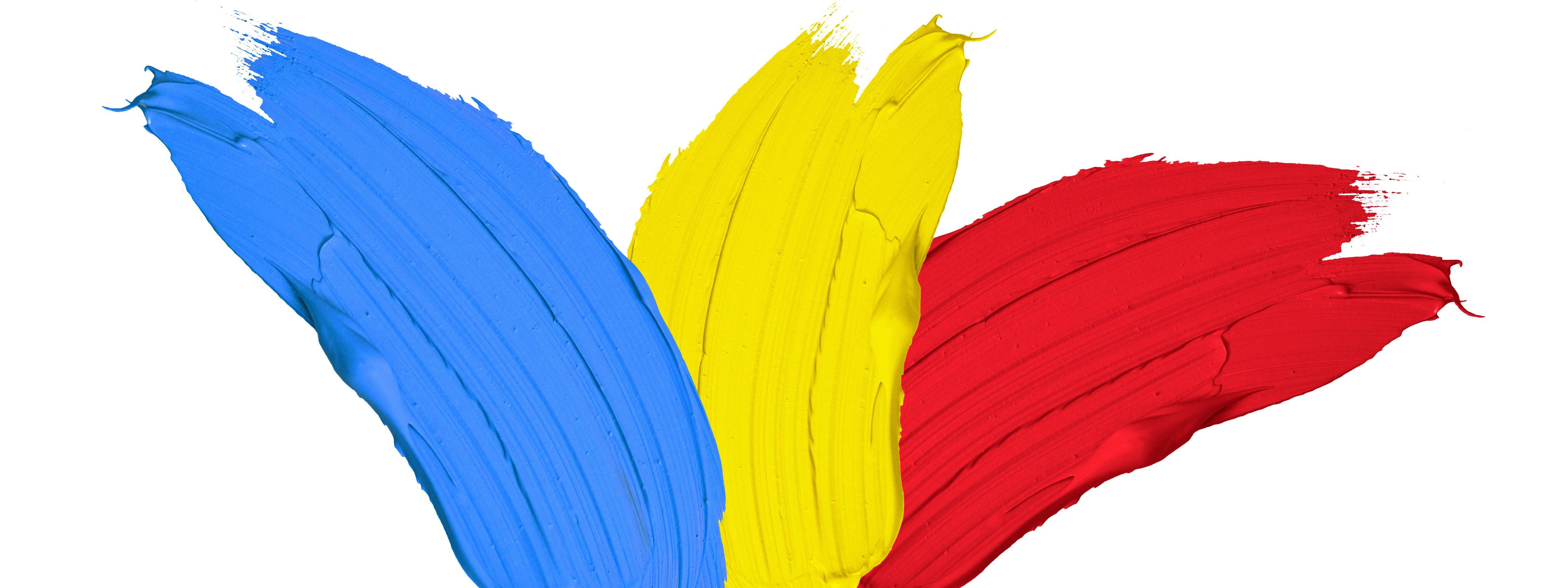
Let's take a closer look at the traditional primary colors: red, yellow, and blue. In painting and art, these colors are often referred to as the primary pigments.
Red pigment is commonly associated with warmth, energy, and passion. It is used to create a wide range of hues, from soft pinks to deep maroons. Yellow pigments are associated with brightness, happiness, and optimism. They can create a range of shades, from pale yellows to vibrant oranges. Blue light is often associated with calmness, serenity, and depth. It can create various shades of blue, from light baby blues to deep navy blues.
While these colors are widely recognized as primary colors in the traditional sense, it's important to note that they are not the only primary colors in different color models. Other primary colors, such as cyan, magenta, and green, play a significant role in different color systems.
Limitations and Misconceptions
While the traditional red, yellow, and blue model has been widely accepted as the primary colors, there are limitations and misconceptions associated with this color system.
One limitation is that the traditional red, yellow, and blue (RYB) primaries do not provide a wide gamut of colors. Mixing these primaries can result in dull and desaturated colors, limiting the range of colors that can be achieved.
Another misconception is that secondary colors, such as orange, purple, and green, can be created by mixing the primary colors. However, in the traditional color theory, secondary colors are created by mixing equal amounts of two primary colors. For example, mixing red and yellow creates orange, while mixing blue and yellow creates green.
It's important to understand these limitations and misconceptions to have a more comprehensive understanding of primary colors and their role in color theory.
Beyond the Basics: Revisiting Primary Colors
In recent years, there has been a shift in the understanding of primary colors. While the traditional red, yellow, and blue model is still widely used, there is a growing recognition of other primary colors that offer a larger gamut of colors.
Cyan, magenta, and yellow have emerged as alternative primary colors in different color models. These colors are widely used in the printing industry and are considered the optimal subtractive primaries. When combined in different proportions, they can create a wide range of colors, including secondary and tertiary colors.
Understanding these alternative primary colors expands our color possibilities and allows for more vibrant and diverse color palettes. It also highlights the importance of color models and their impact on color mixing and perception.
The Role of Cyan, Magenta, and Yellow in Modern Color Theory
Cyan, magenta, and yellow, also known as the subtractive primary colors, play a crucial role in modern color theory. These colors are used in subtractive color mixing, where pigments or inks are combined to create different colors.
In the subtractive color model, cyan absorbs red light, magenta absorbs green light, and yellow absorbs blue light. When these colors are mixed together, they subtract specific wavelengths of light, resulting in the perception of different colors. This subtractive color mixing process is used in printing, where printing inks are combined to create a wide range of colors.
The use of cyan, magenta, and yellow as subtractive primary colors provides a more comprehensive and accurate representation of color mixing and allows for a greater range of color possibilities.
How Digital Technology Influences Our Understanding of Primaries
The advent of digital technology has significantly influenced our understanding of primary colors. Digital displays, such as televisions, computer monitors, and mobile devices, use the RGB model as the primary colors of light.
In the RGB model, red, green, and blue are the primary colors, and they are used to create a wide range of colors on digital screens. Each pixel on a digital display is made up of red, green, and blue subpixels, which emit different intensities of light to create the desired color. By adjusting the intensity of each subpixel, the display can create different colors and shades.
Understanding the RGB model and the role of red, green, and blue as primary colors of light is crucial for digital design and visual communication. It allows us to create vibrant and accurate colors for digital displays.
Practical Applications in Monoprinting
Primary colors have practical applications in various art forms, including monoprinting. Monoprinting is a printmaking technique that produces unique prints by transferring ink or paint from a plate to paper or other surfaces.
In monoprinting, primary colors are used to create a palette of colors that can be mixed and layered to achieve different shades and hues. The primary colors serve as the foundation for creating a wide range of colors and allow the artist to explore different color combinations and effects. By understanding primary colors and their interactions, artists can create visually striking and unique monoprints.
Preparing Your Palette for Monoprinting
Before starting a monoprinting project, it's important to prepare your palette of colors. In monoprinting, the primary colors are typically used as the base colors for mixing and creating other colors.
To prepare your palette, start with a clean surface, such as a white sheet of paper. This allows you to work with a neutral background and ensures that the colors you mix and apply are true to their intended shades before applying them to your gel plate.
Next, gather your primary colors: red, yellow, and blue. These colors will serve as the set of primaries for your monoprinting project. By mixing different proportions of these primary colors, you can create a wide range of secondary and tertiary colors, expanding your color palette and allowing for more creative possibilities.
Techniques for Mixing Primary Colors in Printmaking
In printmaking, mixing primary colors is an essential technique for creating a range of colors and achieving desired effects. By understanding subtractive color mixing and the properties of primary colors, artists can create beautiful and harmonious prints.
Here are some techniques for mixing primary colors in printmaking:
- Overlapping: Apply primary colors in layers, allowing them to overlap and create new colors where they meet.
- Blending: Use a brush or roller to blend primary colors together, gradually mixing them until the desired shade is achieved.
- Gradation: Create a gradation of colors by gradually transitioning from one primary color to another. This technique can be achieved by blending colors or creating smooth transitions with a brush or roller.
By experimenting with these techniques and exploring the range of colors that can be created by mixing primary colors, artists can create dynamic and visually appealing prints.
The Psychological Impact of Primary Colors
Primary colors have a significant psychological impact on our emotions and perception. They play a crucial role in color psychology, which studies the effects of color on human behavior and emotions.
Different primary colors elicit different emotional responses. For example, red is often associated with passion, energy, and excitement, while blue is associated with calmness, serenity, and stability. Yellow is often associated with happiness, optimism, and creativity.
In art and design, the use of primary colors can evoke specific moods and create visual impact. Artists and designers carefully consider the psychological impact of colors when creating their works, using primary colors strategically to convey their intended messages and evoke specific emotional responses.
Emotional Responses to Color
Primary colors – red, yellow, and blue – aren't just the building blocks of countless other hues; they're powerful tools that can influence our emotions and perceptions in profound ways. Understanding the psychology behind these vibrant colors can be incredibly beneficial in various aspects of life, from design choices to artistic expression.
Red: The Color of Passion and Power
Red is a bold and fiery color that grabs attention and ignites strong emotions. It's often associated with:
- Passion and Excitement: The warmth of red evokes feelings of love, desire, and a surge of energy. It can be used to stimulate the appetite in restaurants or create a sense of urgency in marketing campaigns.
- Dominance and Power: Red is a color of leadership and confidence. It can inspire action and encourage decisiveness, but overuse can also trigger feelings of aggression or danger.
- Alertness and Attention: Red's ability to stand out makes it a natural choice for warning signs or stop buttons.
Yellow: The Color of Sunshine and Optimism
Yellow is a cheerful and optimistic color that brings a sense of sunshine and warmth. It's known to evoke:
- Happiness and Joy: Yellow's bright and sunny nature uplifts mood, stimulates creativity, and promotes feelings of well-being. It's often used in children's spaces or areas where a positive atmosphere is desired.
- Mental Clarity and Focus: Yellow can enhance concentration and improve cognitive function. It can be a good choice for study areas or workspaces.
- Caution and Warning: A lighter shade of yellow can also indicate caution or indecisiveness.
Blue: The Color of Tranquility and Trust
Blue is a calming and serene color that evokes feelings of peace and security. It's associated with:
- Peace and Tranquility: The vastness of the blue sky and ocean is reflected in this color's ability to promote relaxation and reduce stress. It's a popular choice for bedrooms and spas.
- Trust and Reliability: Blue is often linked with trustworthiness, loyalty, and dependability. It's commonly used in branding for financial institutions or healthcare providers.
- Sadness and Melancholy: While blue is generally calming, darker shades can evoke feelings of sadness or loneliness.
It's All About Context
It's important to remember that the psychological impact of these colors is not absolute. Here are some factors that can influence how a primary color is perceived:
- Shade and Tint: Lighter or darker versions of a primary color can have a different effect. For example, a pastel yellow might feel more calming than a bright mustard yellow.
- Cultural Associations: Color symbolism can vary across cultures. Red might represent good luck in some cultures, while signifying danger in others.
- Color Combinations: How primary colors are paired with each other can significantly influence the overall mood. For instance, red and yellow together can create a feeling of excitement, while blue and green can evoke a sense of serenity.
By understanding the psychology of primary colors, we can harness their power to create specific emotional responses. Whether it's an artist choosing colors to evoke a certain feeling in a painting or a designer selecting a color scheme for a website, understanding these colors' impact can lead to more powerful and effective creations.
Color Psychology in Art and Design
Color psychology plays a significant role in art and design. Artists and designers use the psychological impact of color to convey specific moods, create visual impact, and evoke emotional responses from viewers.
In art, the choice of primary colors can set the tone and mood of a piece. For example, using vibrant reds and yellows can create a sense of energy and excitement, while using cool blues can evoke a feeling of calmness and serenity.
In design, the strategic use of primary colors can influence the perception of a brand or product. For example, using bold and vibrant primary colors can create a sense of excitement and urgency, while using softer tones can create a sense of elegance and sophistication.
Understanding the psychology behind primary colors allows artists and designers to create impactful and visually engaging works that resonate with their audience.
Conclusion
Primary colors are not just red, yellow, and blue; they delve deeper into the realms of color perception, psychology, and modern technology. Understanding the science and psychology behind primary colors can enhance your artistic endeavors and emotional responses to color.
By revisiting traditional views and exploring cyan, magenta, and yellow, you unlock a world of vibrant possibilities in art and design. Embrace the nuances of primary colors in monoprinting techniques and prepare your palette for a colorful journey through the realms of emotion and perception. Dive into the world of primaries beyond the basics for a richer, more profound artistic experience.
Frequently Asked Questions
Why Are Red, Yellow, and Blue Considered Primary Colors?
In the traditional view, red, yellow, and blue are considered primary colors because they cannot be created by mixing other colors together. This concept dates back to the color wheel developed by Isaac Newton in the 17th century.
Can Primary Colors Be Mixed to Create All Other Colors?
No, primary colors cannot be mixed to create all other colors. While primary colors serve as the foundation for creating a wide range of colors, secondary colors are created by mixing equal amounts of two primary colors. Tertiary colors are then created by mixing a primary color with a secondary color.
How Do Primary Colors Affect Mood and Perception in Art?
Primary colors can have a significant impact on mood and perception in art. Different primary colors evoke different emotional responses, which in turn affect the viewer's perception of the artwork. Artists strategically use primary colors to create specific moods and convey their intended messages.
What Are Some Common Misconceptions About Primary Colors?
One common misconception is that the traditional red, yellow, and blue (RYB) model is the only set of primary colors. Another misconception is that primary colors can be mixed to create all other colors. It's important to understand the different color models and their respective primary colors to avoid these misconceptions.
What Are Primary and Secondary Colors?
Primary and secondary colors are the building blocks of color mixing!
- Primary colors are the three colors that you can't mix by combining other colors. They are red, yellow, and blue.
-
Secondary colors are created by mixing two primary colors in equal parts. Here's the breakdown:
- Red + yellow = orange
- Red + blue = purple
- Blue + yellow = green
There's also a concept called tertiary colors, which are created by mixing a primary color with a secondary color. These appear next to each other on a color wheel.

What are the 3 Primary Colors and 3 Secondary Colors?
The 3 primary colors are:
- Red
- Yellow
- Blue
These colors cannot be created by mixing other colors.
By mixing these primary colors in equal parts, you can create the 3 secondary colors:
- Red + Yellow = Orange
- Red + Blue = Purple
- Blue + Yellow = Green
Are Primary Colors Cool or Warm?
Primary colors are generally classified as:
- Warm: Red, Orange (though orange is a secondary color, all its components are warm)
- Cool: Blue
- Neutral (or debatable): Yellow
Here's a breakdown:
- Warm colors like red and orange are associated with fire, sunshine, and evoke feelings of warmth, energy, or passion.
- Cool colors like blue are associated with water, sky, and evoke feelings of calmness, peace, or tranquility.
- Yellow is a trickier case. It can lean warm or cool depending on its shade. A yellow with a hint of red feels warmer, while a yellow with a hint of green feels cooler.
Some artists consider yellow a true primary color, while others use a slightly different set that leans cooler (like magenta instead of red). This can make yellow seem more neutral overall.
What is a Cool Color?
Cool colors are generally those that evoke feelings of calmness, peace, or tranquility. They are often associated with elements found in nature like water, the sky, or shadows. Here's a breakdown of cool colors:
- Color Wheel: Cool colors sit on the opposite side of the color wheel from warm colors. This typically includes blue, green, and purple, along with their variations and shades.
- Psychology: Cool colors are known to have a calming and relaxing effect. This is why they are often used in bedrooms, bathrooms, and spas.
-
Examples: Some popular cool colors include:
- Blue: sky blue, navy blue, teal
- Green: forest green, mint green, seafoam green
- Purple: lavender, violet, indigo
Even though these are the basic cool colors, it's important to remember that colors can be perceived as cooler or warmer depending on the context. For instance, a light blue next to a bright red will appear cooler, while a deep green next to a teal might feel warmer.
What is a Warm Color?
Warm colors are those that evoke feelings of warmth, energy, or passion. They are often associated with fire, sunshine, and summer. Here's a breakdown of what makes a color warm:
- Color Wheel: Warm colors sit on one side of the color wheel, typically including red, orange, and yellow, along with their variations and shades.
- Psychology: Warm colors are known to create a stimulating and energetic feeling. This is why they are often used in restaurants, gyms, and living rooms where you want to create a lively atmosphere.
-
Examples: Some popular warm colors include:
- Red: fire engine red, burgundy, crimson
- Orange: tangerine, burnt orange, coral
- Yellow: lemon yellow, gold, mustard yellow
Shades and Tints: It's important to note that even within warm colors, shades and tints can influence how warm they feel. A shade (adding black) will make a warm color appear cooler, while a tint (adding white) will make it feel paler and potentially cooler as well.
- For instance, a dark red (a shade) might feel more intense than a light pink (a tint of red), even though they both come from a warm base color.
Context Matters: Similar to cool colors, the perception of warmth can also be influenced by the colors surrounding it. A warm yellow might appear even warmer next to a cool blue, but cooler next to a bright orange.