

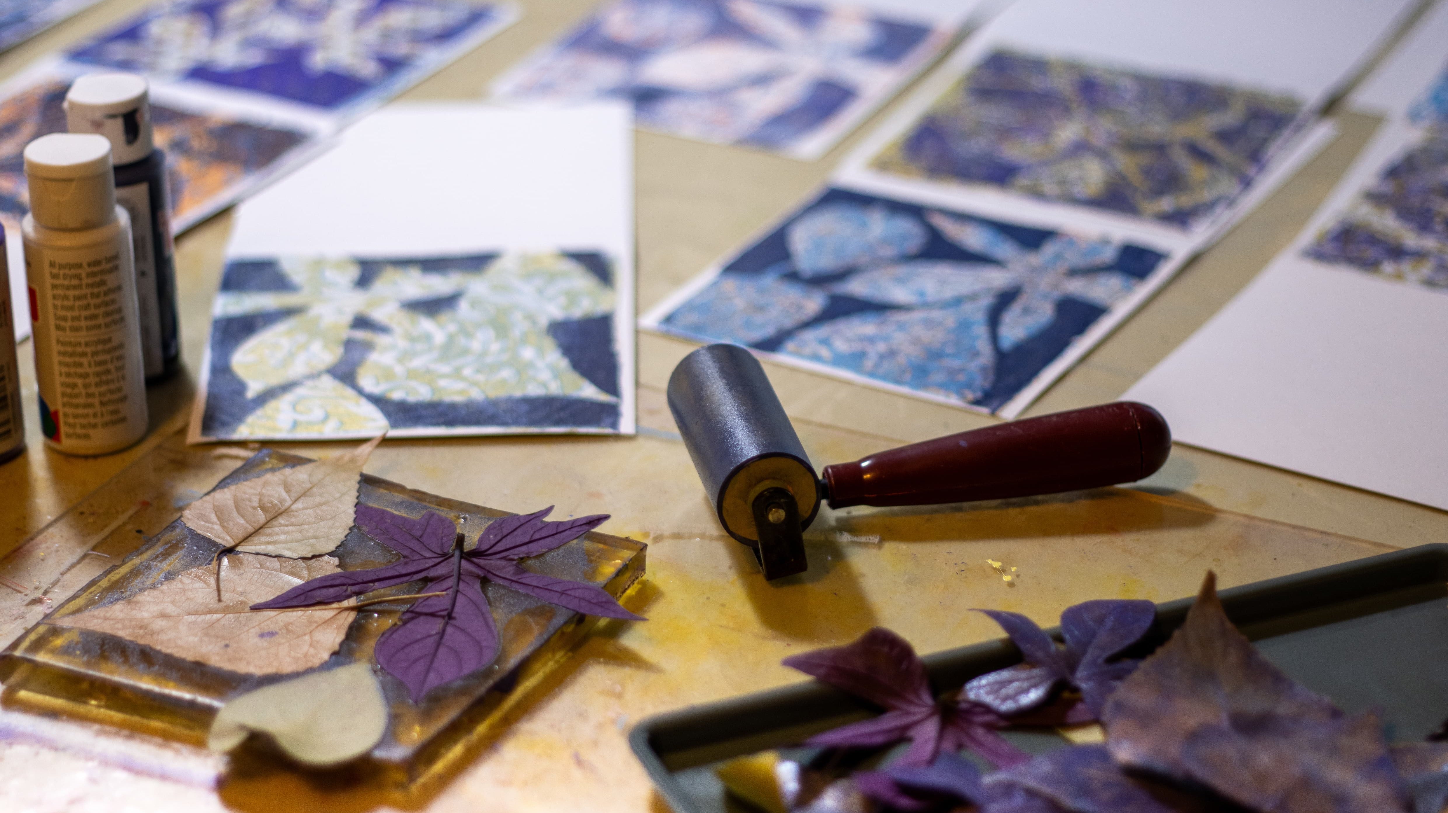
Discover seven creative DIY Mother’s Day gift ideas made with monoprinting and a gel plate. Learn simple, heartfelt projects kids and adults can make at home, from greeting cards to keepsake crafts.
Art & Inspiration
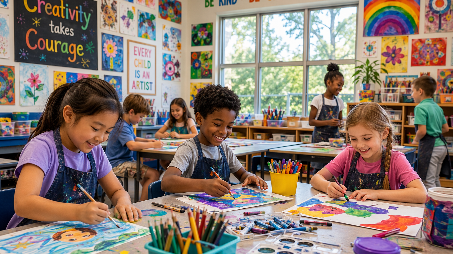
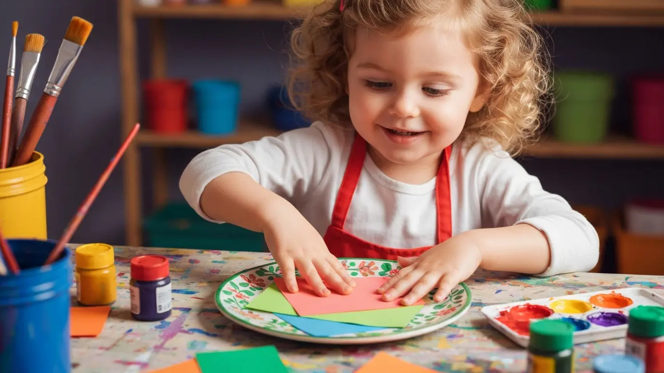
Explore Back to School Art Suppliers for Classroom Ideas
Key Highlights Back to school art supplies help teachers kick off the school year with fun classroom activities and creative projects. Some of the core, essential tools are paper, paint,...
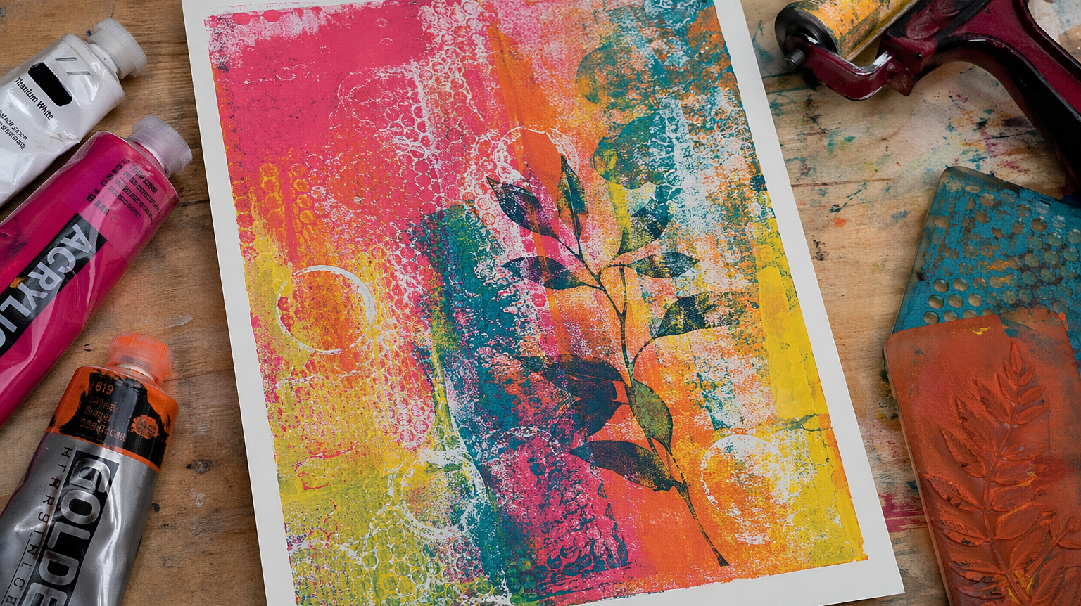
How to Use Gel Press Plate for Stunning Texture Prints
How to Use Gel Press Plate for Stunning Texture Prints Key Highlights A gel plate is great for gel printing. It is simple to use, gives you many options, and...
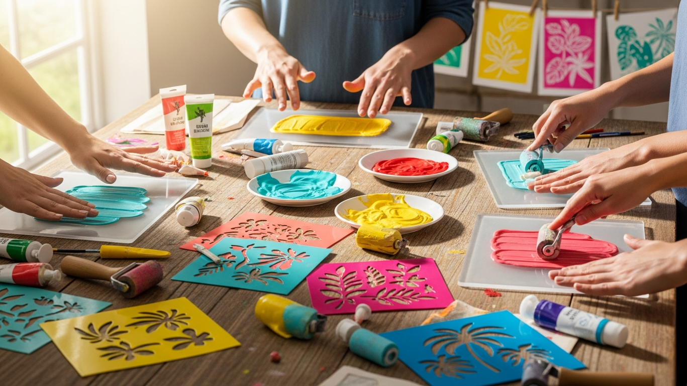
Discover Gel Printing: Your Perfect Summer Art Workshop
Key Highlights Find out why gel printing is a good and fun thing to do in summer art workshops and for learning programs. Learn the basics of how gel printing...

How Gel Printing Can Boost Your Etsy Art Sales Today
Key Highlights Gel printing is a fun way to make special, one-of-a-kind prints for your Etsy shop. You only need a few things to get going on this. A gelli...
Gelli Plate: Create Unique Monoprints Every Time
Key Highlights Find out the basics of gelli plate printing. This is a fun and easy monoprint way that is great for beginners. Get to know the tools you will...

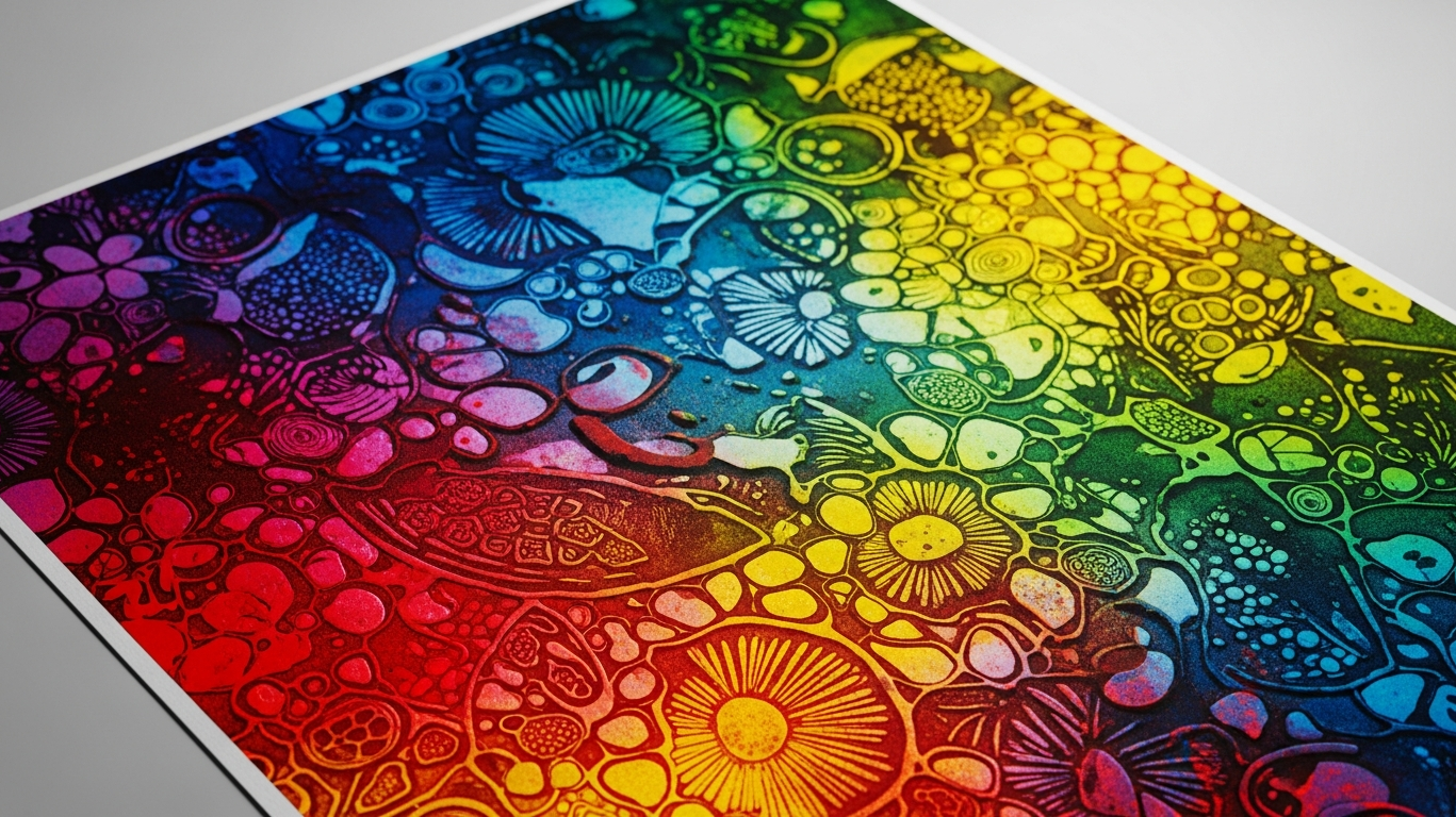
10 Unique Gel Printing Techniques You Haven't Tried Yet
Unlock the colorful world of gel printing—the press-free monoprinting method taking the crafting world by storm! Whether you're a seasoned artist or a total beginner, a silicone gel plate is your gateway to creating stunning, one-of-a-kind papers and fabrics. From mastering "ghost prints" and botanical impressions to troubleshooting common mistakes like paint bleed, this guide covers 10 essential techniques to help you create professional-quality prints at home.
Gel Plate Printing for Beginners: Everything You Need to Know
Ready to unlock your inner artist? Gel plate printing is the ultimate "no-stress" entry into the world of printmaking. No expensive press or sharp carving tools required—just a soft plate, a roller, and your imagination. Whether you're looking to create unique greeting cards or stunning mixed-media backgrounds, our comprehensive beginner's guide covers everything from essential tools to your very first "reveal." Dive in and discover why this spontaneous, messy-in-the-best-way hobby is taking the art world by storm!
15 Creative Spring Craft Ideas to Brighten Your Home
Bring fresh color and creativity into your home with these 15 fun and easy spring craft ideas. From gel press prints and handmade decor to family-friendly projects, this guide helps you make beautiful, seasonal pieces that brighten your space.
