

“Spring is nature’s way of saying ‘Let’s Party!’” Robin Williams
Spring is here and I am ready to throw a party! Creating just the right atmosphere for a dinner party at your house is very important to the party’s success and it is the same with designing the perfect painting – and harmony is the answer! These days I love working on prepared surfaces – surfaces rich in color, pattern and texture. I think it provides an excitement – much like a party – to my paintings these days. However, like any great party everyone needs to get along, talk, and enjoy each other’s company to ensure the success of the party. It is the same with your artwork, no matter what you are creating, all the parts must harmonize and connect or it all falls apart!

So here are 8 steps to throwing the perfect party on your paper
1. Pick a good group of guests – choose a great group of colors

When throwing a party you want to choose friends who all get along well, have similar interests, and have at least some things in common.
Choosing the perfect palette combos for gel press printing is the same! Try printing with analogous colors or what I like to call “neighborhood colors” – colors that live next door to each other on the color wheel – ie, quinacridone nickel azo gold, quinacridone magenta, quinacridone burnt orange. Don’t mix in complementary colors during this part of the process (even though it will be a temptation). Use tissue paper and deli paper (because they are lightweight and easy to collage) and pull tons of prints (that should not be a big problem!).
2. Go with what you know – selecting a great reference photo

For your party it makes sense to choose simple dishes you’ve whipped up at least once or twice before the big event so you are familiar with them. In regards to your photo, if at all possible, try to use your own photography for this project or a simple subject you are very familiar with. I always tell my students – it’s always going to be a better painting if you use references with subjects you have met in person! Selecting the right reference photo is easy – make sure the subject is well lit – with strong lights and darks – and a very simple subject matter – ie, pears, vase of daisies, apples, etc…. Pick something that is appealing to you – that helps – but make sure you have met this subject in person!
3. Let’s Get This Party Started! – PRINT!!!
The party attitude starts with you! And Gel Printing starts with an attitude of FUN! So just get in there and start throwing paint and pulling prints!

4. Go easy with the hors d’oeuvres – selecting prints to collage
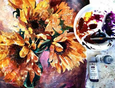
An overzealous cheese plate means nobody will be hungry for the fabulous meal you made. Much the same way, having too much color, texture and pattern will mean nobody will be able see the subject of the painting. Limit your selection of prints you want to use and keep them simple. You should start by selecting prints with colors similar to the reference photo you are working from. For example – the yellow in the sunflowers and red-violet shadows were the basis for the prints I choose.

Utilizing harmonious color combinations is one way to ensure all of your guests – shapes, texture, lines, etc… – are talking and connecting with each other. Once they are all laid out and you are satisfied, I begin to lay down an even coat of matte medium starting in one corner and working out from there until everything is glued down and then I finish and seal the entire surface with a coat of matte medium.
5. Prep Like a Boss – Drawing in the subject

You want to prepare the perfect atmosphere and setting for your guests ahead of time – this sets the tone for your party. Having great shapes with a strong composition starts your painting off with a strong foundation and prepares you to have success! Don’t be tempted to skip a few shapes here or there during the drawing process as great shapes will help you not to get “lost” once you begin painting – especially on a surface with such rich texture. Just like you need everything set up just right before your guests arrived, you also need great shapes that will ensure an easy painting process.
6. Dim The Lights – painting the darker shapes to create your lighter shapes
Light is important. Using lights for aesthetic purposes creates the perfect ambiance for the party. Lights and darks in a painting also create ambiance and help us to see shapes. So the base color of the prepared surface of collaged gel prints becomes the lightest value in your composition. I begin this process by painting in my darker values and shadows. You can use your smart phone/computer to create a black & white version of your photo reference. This will help you see where the darker values are.
7. Don’t forget about dessert – finishing touches
The dessert is the last and arguably most important course of your dinner. It leaves your guest satisfied and they will most certainly leave your party on a high note. So finish your painting well and take your time! Many students ask me: “how do you know when your painting is finished?”. Your painting is finished when you feel pleased with what you have done, all of your darks and lights are firmly established, and all design elements are satisfied. It is part knowing the elements and principles of design have been completed but it is also a feeling – a sense of completion.

8. Laugh it off – no serious attitudes allowed!
Last but not least, don’t take your painting or your dinner party too seriously! Nobody will care if the casserole is misshapen or the drinks don’t have umbrellas! In the same way no will care if everything is just perfect on your painting! After all, it is just a few pieces of paper! So above all have fun with this project, keep it simple, and don’t get too serious! After all, who wants to go to a serious dinner party?! I hope I have inspired you to throw a party on your paper! Now, go have some fun!
Supplies – Step 1

- Gel Press 12 x14 or 12 x 12 plate
- Golden Open Acrylics – various colors (or you can use whatever acrylics you have)
- Stencils from Trish McKinney’s designs featured through StencilGirl Products“Mysterious Wisteria”, “Branches”, & “Ribbons & Swirls”
- Print Substrates: tissue paper & deli paper
- Economy Brayer
- Various Texture/Mark-Making Tools (i.e., Catalyst Blades, various stamps, string, etc.)
Steps
- Pull several prints in “neighboring” color schemes using tissue & deli paper – examples of color schemes:
yellows + oranges + reds
purples + blues
blues + greens - Vary and play with printing light and dark values within the color schemes.
- Use stencils, stamps and other mark-making tools to create textural effects and masks – be creative!
Supplies – Step 2

- Tissue paper Gel Printed prints (from Step 1)
- Matte Medium
- Gesso
- Golden Fluid Acrylics – various colors
- Small Sponge Roller – 1” width or smaller
- Synthetic Brushes – golden or white taklon – 2” – ½” flats, #14 & #8 rounds
- 1 sheet watercolor paper, cut 22” x 22” – I used Strathmore, 400 series watercolor paper (140lb.) or you can use Arches 140lb. cold press
- A strong reference photo of a still life or simple flower, with strong lighting (important) and simple color
Steps
- Select several interesting gel prints in the overall colors of your lightest value (i.e., for the area of my sunflowers I used yellows, light pinks, and oranges; for my shadow area I used red-violets, siennas and violets. I then laid out the gel prints I selected and positioned them on the paper to plan out light and dark passages – tear edges so the edges are soft when overlapping)
- Using matte medium, collage papers onto the watercolor paper
- Draw out your still life or flower
- Begin by painting the negative shapes, allowing the lightest value to be the original collaged, prepared surface (the tissue paper gel prints will be the lighter areas)
- Use gesso lightly when an area needs to be made slightly lighter and softer – if textural gel prints that are too distracting in your light value areas. Soften the gesso application with a small sponge roller.
- Build up darker values of shadow areas by applying paint in 2 to 3 layers
Finish & sign!!!

Trish McKinney - Working Artist for Gel Press